
Black Country Volleyball Club
An effective sports brand should reflect the features of the organization at its most basic level, and align with the values the team represents. Black Country Volleyball Club needed to rebrand, update, and modernise its visuals, and integrate all that represents the club.
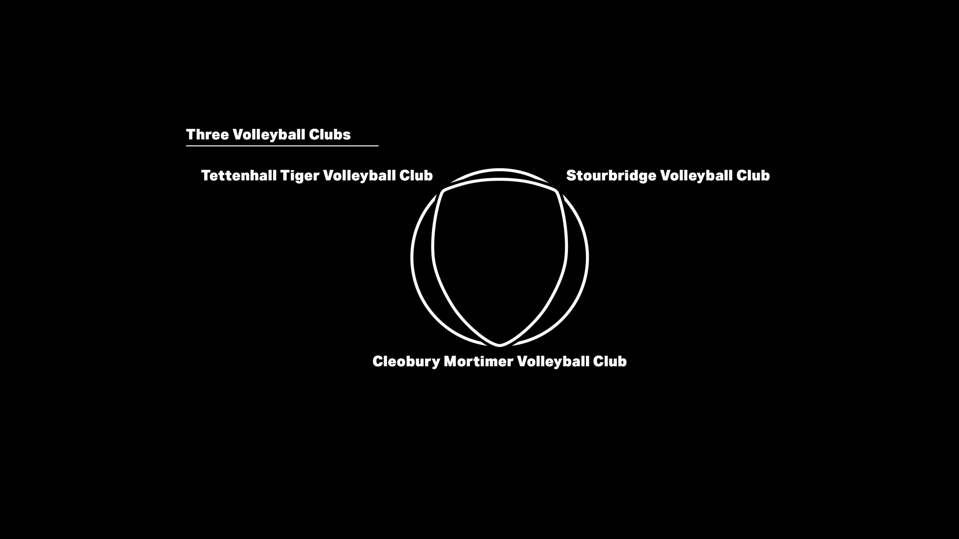
This was due to the lack of a distinct identity that represented the volleyball club. Prior to this, it simply used the Black Country Flag for its identity, but it is a generic symbol of the region, not of a specific organisation. The goal is to use the Black Country flag with symbols that identify the volleyball club to give it its own identity.
Agency - Freelance Designer
Role - Branding, Art Direction, Illustration, Social Media
& Motion Graphic.


Testimonial
"As Black Country continues to progress on the court, we felt it was imperative to improve our identity both within the volleyball community and the broader community. Jon has been working extremely hard to come up with something that incorporates Volleyball and the Black Country flag, eventually presenting two options to the membership. This redesigned logo, as shown, was the clear winner and will now be at the forefront of Club Clothing and Social Media for a long time."
Carl Brookes - Chairman of Black Country Volleyball Club